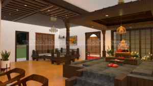
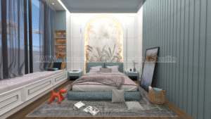
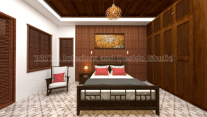
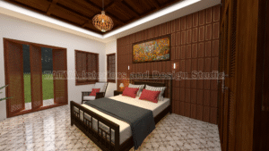
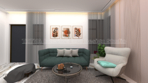
How to Choose Colours for Home Interiors
Choosing the right colours is one of the most important decisions in home interior design. Colours influence how spacious, bright, warm, calm, or energetic a room feels. Therefore, the right colour palette can make a major difference to the overall appearance of your home.
However, choosing colours is not simply about selecting your favourite shade. The room size, natural light, flooring, furniture, ceiling height, materials, and overall design style should also influence your decision.
A good colour scheme should create visual balance across the entire home. It should also complement the furniture and finishes instead of competing with them.
At Tatva Interiors & Design Studio, colour selection can be developed along with space planning, furniture design, materials, lighting, and 3D visualization. You can explore the Services page for more information.

Start With the Overall Interior Style
Before choosing individual colours, decide on the overall style of your home.
For example, a modern interior may work well with neutral colours, clean finishes, and subtle accents. A contemporary home can combine warm neutrals with wood finishes and stronger accent colours.
A minimalist interior usually benefits from a limited colour palette. Meanwhile, a more luxurious design can include deeper colours, metallic accents, and richer materials.
Therefore, your interior style should guide the colour selection.
Consider the Size of the Room
Room size can influence how colours appear.
Light colours can make a compact room feel brighter and more open. Darker colours can create depth and a more intimate atmosphere.
However, this does not mean that dark colours should never be used in small rooms.
A dark accent wall can add character without making the entire room feel heavy.
Therefore, use colour according to the proportions of the room rather than following a fixed rule.
Understand Natural Light
Natural light can significantly change the appearance of a colour.
A room with large windows may handle deeper colours more comfortably. A room with limited natural light may benefit from warmer or lighter shades.
The direction of the windows also matters. Therefore, test your chosen colours in the actual room before finalizing them.
For example, a beige that looks warm in one room may appear cooler in another because of the available daylight.
Consider Artificial Lighting
The colour of artificial lighting can also affect how walls and furniture appear.
Warm lighting can make beige, cream, peach, and wood tones look warmer. Cooler lighting can make some colours appear sharper or more neutral.
Therefore, evaluate paint, laminates, fabrics, and other finishes under the lighting you plan to use.
This is especially important for bedrooms, living rooms, and kitchens.
Follow the 60-30-10 Colour Rule
The 60-30-10 rule is a useful starting point for creating a balanced palette.
60% — Main Colour
This can cover most walls, large surfaces, and major areas.
30% — Secondary Colour
This can appear through furniture, curtains, flooring, wardrobes, or other larger elements.
10% — Accent Colour
This can be introduced through cushions, artwork, décor, feature elements, or selected furniture.
Therefore, the rule can help prevent a room from becoming visually overwhelming.
Choose a Main Neutral Colour
Start with one primary neutral colour for the home.
Popular options include:
- Warm ivory
- Beige
- Cream
- Soft grey
- Greige
- Light taupe
- Off-white
A neutral base gives you flexibility when selecting furniture and accent colours.
For example, warm ivory can work with wood, sage green, navy blue, soft peach, or muted terracotta.
Therefore, choosing the main neutral first can simplify the rest of the design process.
Add a Secondary Colour
Once the main colour is selected, choose a secondary colour that complements it.
For example:
Warm ivory + light wood
creates a warm and natural interior.
Soft grey + walnut
creates a sophisticated appearance.
Beige + sage green
creates a calm and natural atmosphere.
Therefore, the secondary colour should support the main palette rather than compete with it.
Use Accent Colours Carefully
Accent colours can add personality to a home.
You can introduce them through:
- Feature walls
- Cushions
- Curtains
- Artwork
- Chairs
- Rugs
- Decorative objects
- Furniture details
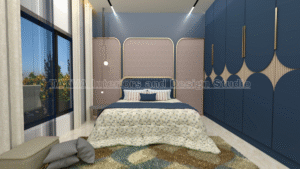
For example, navy blue can add depth to a neutral living room. Sage green can introduce a natural character.
Therefore, accents should be used selectively.
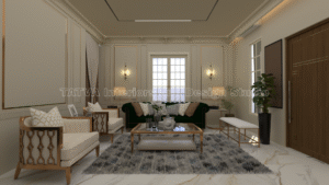
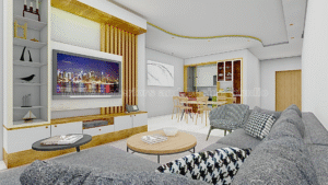
Colour Combination for Living Room
The living room is often the most visible area of the home. Therefore, choose a palette that feels welcoming and works with your furniture.
Some combinations include:
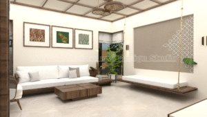
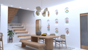
Warm Ivory + Light Wood
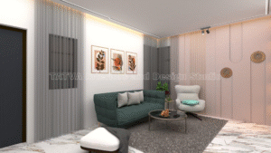
This creates a soft and warm contemporary look.
Beige + Walnut
This creates a richer and more sophisticated atmosphere.
Soft Grey + Light Wood
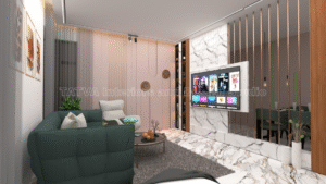
This creates a modern and balanced appearance.
Warm Ivory + Sage Green
This introduces a calm, natural character.
Cream + Navy Blue
This creates a stronger contrast while maintaining an elegant appearance.
Therefore, select the combination according to the amount of natural light and the existing furniture.
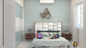
Colour Combination for Bedrooms
Bedrooms should generally feel calm and comfortable.
Soft neutrals can work well as the primary colours.
Consider:
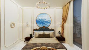
Warm ivory + beige + light wood
for a warm and relaxing bedroom.
Soft grey + white + natural wood
for a modern bedroom.
Warm ivory + soft peach
for a gentle and subtle look.
Beige + muted sage green
for a natural atmosphere.
Therefore, avoid using too many strong colours in the bedroom.
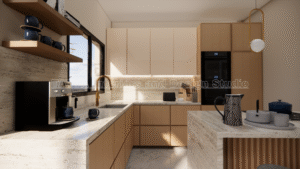
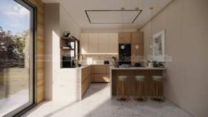
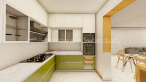
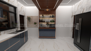
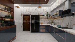
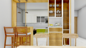
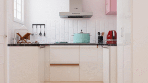
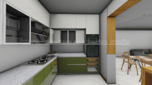
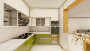
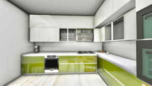
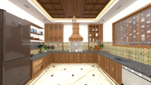
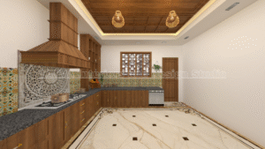
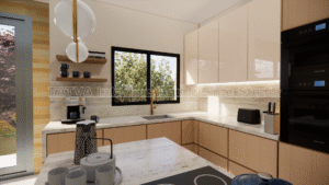
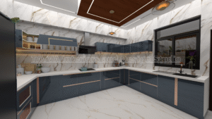
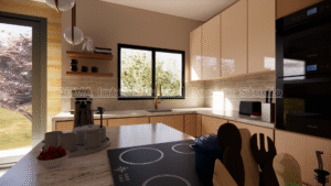
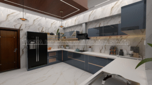
Colour Combination for Modular Kitchens
Kitchen colours should complement the cabinets, countertop, backsplash, flooring, and adjoining spaces.
Popular combinations include:
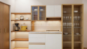
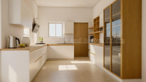
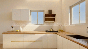
White + light wood
for a bright contemporary appearance.
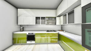
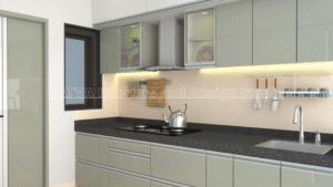
Sage green + wood
for a natural and warm look.
Warm beige + walnut
for a richer appearance.
Soft grey + white
for a clean modern kitchen.
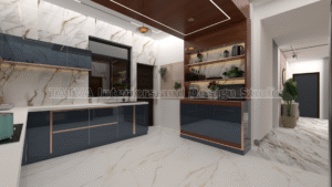
Navy blue + light wood
for stronger contrast.
Therefore, kitchen colours should be selected along with the cabinet and countertop materials.
You can explore Tatva’s Modular Kitchen Design Services.
Colour Combination for Small Homes
Small homes can benefit from lighter base colours.
Warm ivory, cream, beige, and soft grey can help maintain a brighter visual appearance.
You can then introduce colour through furniture, artwork, curtains, or one feature wall.
For example:
Warm ivory + light oak + sage green
can create a soft and natural interior without making the space feel heavy.
Therefore, a light base with controlled accents can work well in compact homes.
Colour Combination for Large Homes
Larger homes provide more flexibility.
You can use deeper accent colours, darker wood finishes, and stronger contrasts without overwhelming the space.
For example:
Warm beige + walnut + deep green
can create a sophisticated appearance.
Similarly, cream + dark wood + navy blue can create a more dramatic interior.
However, large spaces still require visual balance.
Therefore, use stronger colours strategically rather than covering every surface.
Match Colours With Flooring
Flooring occupies a large visual area. Therefore, it should be considered before finalizing wall and furniture colours.
Light flooring can work well with darker furniture and stronger accents.
Dark flooring can be balanced with lighter walls and furniture.
Wood-look flooring can work with warm neutrals, beige, cream, sage green, and other natural tones.
Therefore, your wall colour should complement the flooring instead of competing with it.
Match Colours With Furniture
Furniture can strongly influence the colour palette.
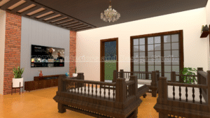
If you already have a dark wood sofa or cabinet, lighter walls can provide balance.
If your furniture is light, you can introduce stronger colours through a feature wall or accent furniture.
Therefore, select wall colours after considering the major furniture pieces.
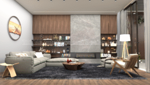
Consider Wood Finishes
Wood is commonly used in Indian home interiors.
Different wood tones can create different moods.
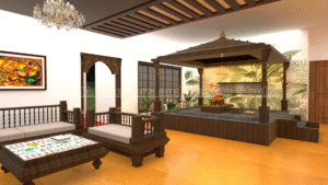
Light wood can make a room feel brighter and more contemporary. Medium wood can create warmth, while dark walnut can add richness and contrast.
Therefore, choose wall and accent colours that complement the selected wood finish.
Use Warm and Cool Colours Together Carefully
Warm colours include shades such as beige, cream, peach, terracotta, and warm brown.
Cool colours include blue, green, and some grey tones.
A balanced combination can create visual interest.
For example, warm ivory with muted sage green can feel calm and natural.
Similarly, warm beige with dusty blue can create a balanced contemporary look.
Therefore, combining warm and cool tones can work well when the undertones are compatible.
Understand Colour Undertones
Two colours can look similar but have different undertones.
For example, one beige may have a yellow undertone while another may have a grey or pink undertone.
These differences can become obvious when the colours are placed next to flooring, furniture, or lighting.
Therefore, always compare colour samples with the actual materials.
Test Colours Before Finalizing
Do not select a colour based only on a small catalogue image.
Obtain physical samples or test the colour on a small section of the wall.
Observe it during:
- Morning
- Afternoon
- Evening
- Artificial lighting
The same colour can look different throughout the day.
Therefore, testing can help you avoid unexpected results.
Use the Same Colour in Different Rooms
You do not need to use completely different colours in every room.
Repeating selected colours can create visual continuity.
For example, warm ivory can remain the main wall colour throughout the home. Different accent colours can then personalize each bedroom.
Therefore, repetition can make the entire home feel more connected.
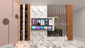
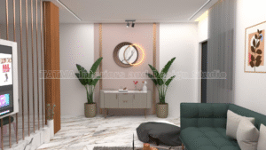
Create Feature Walls
A feature wall can introduce colour without overwhelming the room.
Suitable locations include:
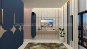
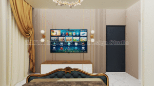
- TV wall
- Bed headboard wall
- Dining wall
- Entry wall
- Study wall
You can use paint, wallpaper, wood, laminate, fluted panels, stone, or other materials.
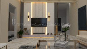
Therefore, a feature wall can become a focal point while keeping the remaining walls simple.
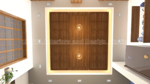
Do Not Ignore the Ceiling
The ceiling is often overlooked during colour planning.
A white or light ceiling can help maintain a sense of height.
However, selected ceiling designs can also include subtle colours or wood details.
Therefore, the ceiling colour should complement the walls rather than being selected independently.
Plan Colours With Lighting
Lighting and colour should be developed together.
Warm lighting can enhance warm neutrals and wood finishes.
Accent lighting can highlight a feature wall or textured surface.
Under-cabinet lighting can also change how kitchen colours appear.
Therefore, evaluate the colour palette under the final lighting concept.
Use 3D Visualization Before Finalizing Colours
3D visualization can help you understand how different colours and materials will work together.
You can compare:
- Wall colours
- Flooring
- Furniture
- Wardrobes
- Kitchen finishes
- Lighting
- Curtains
- Décor
This can be especially useful when you are considering multiple colour combinations.
Therefore, 3D visualization can help reduce uncertainty before finalizing the design.
You can explore Tatva’s 3D Visualization Services.
Common Colour Selection Mistakes
One common mistake is selecting too many colours.
Another is choosing colours without considering natural light.
Ignoring flooring and furniture can also create combinations that do not work well together.
Using dark colours across every surface can make some spaces feel visually heavy.
Another mistake is following trends without considering personal preferences.
Therefore, your colour palette should be attractive, practical, and suitable for your home.
How to Choose Colours for Different Interior Styles
Modern Interior
Use neutral colours with clean contrasts.
Example: Soft grey + white + light wood.
Contemporary Interior
Combine warm neutrals with selected accent colours.
Example: Warm beige + walnut + muted green.
Minimalist Interior
Keep the palette simple and restrained.
Example: Warm ivory + beige + natural wood.
Luxury Interior
Use richer tones with premium materials.
Example: Cream + walnut + deep green or navy.
Natural Interior
Combine earthy neutrals with greens and wood.
Example: Beige + sage green + oak.
Therefore, the colour palette should support the overall design style.
Step-by-Step Colour Selection Process
Step 1: Understand the Room
Check the size, ceiling height, windows, and natural light.
Step 2: Identify Existing Elements
Consider flooring, doors, furniture, countertops, and other fixed materials.
Step 3: Select the Main Colour
Choose a neutral or dominant colour for the largest surfaces.
Step 4: Choose a Secondary Colour
Select a complementary tone for furniture and larger design elements.
Step 5: Add an Accent
Introduce one stronger colour through selected features.
Step 6: Check Lighting
Evaluate the colours under both natural and artificial lighting.
Step 7: Test Samples
Compare physical samples with the actual materials.
Step 8: Visualize the Complete Interior
Use 3D visualization to check how everything works together.
Step 9: Finalize the Palette
Once the combination feels balanced, finalize the colours for each space.
Frequently Asked Questions
Which colour is best for home interiors?
There is no single best colour. Warm ivory, beige, soft grey, cream, and light wood tones are versatile choices, while accent colours can add personality.
Which colours make a room look bigger?
Light and neutral colours can create a brighter and more open visual appearance. However, furniture, lighting, and layout also influence the result.
How many colours should I use in one room?
A simple starting point is three main colour levels: a dominant colour, a secondary colour, and an accent colour.
Should all rooms have the same colour?
Not necessarily. However, repeating selected colours or materials can create visual continuity throughout the home.
Should I choose wall colour before furniture?
If furniture is already purchased, consider it first. Otherwise, develop the overall palette together so that walls, furniture, flooring, and finishes complement each other.
How do I choose colours for a small home?
Start with a light base colour and introduce one or two accent colours. Avoid using too many contrasting shades.
How can I check whether colours will work together?
Use physical samples and compare them under natural and artificial lighting. 3D visualization can also help you understand the complete combination.
Final Thoughts
Knowing how to choose colours for home interiors becomes easier when you stop looking at colours individually and start looking at the complete space.
Consider the room size, natural light, flooring, furniture, materials, lighting, and interior style. Begin with a main colour, add a complementary secondary colour, and then introduce carefully selected accents.
Most importantly, choose colours that you will enjoy living with for years rather than following every passing trend.
At Tatva Interiors & Design Studio, colour planning can be developed together with Interior Design Services, 2D & 3D Floor Plans, 3D Visualization, Modular Kitchen Design, and Custom Furniture Design.
Choose the right base. Add the right accents. Create a home that feels naturally yours.